Wednesday, December 26, 2007

National Cartoonist Society Profile: Hank Ketcham


The National Cartoonist Society is not a guild or union, although they have joined forces from time to time to fight for member's rights, and regularly use their artistic talents to help worthwhile causes. Membership is limited to established professional cartoonists, with a few small exceptions of outstanding persons in affiliated fields. The primary purposes of the NCS are to advance the ideals and standards of professional cartooning in its many forms. To promote and foster a social, cultural and intellectual interchange among professional cartoonists of all types. And to stimulate and encourage interest in and acceptance of the art of cartooning by aspiring cartoonists, students and the general public. Here is another short biography of past NCS member, Hank Ketcham, that sadly passed away in June 2001, thought his world famous strip, based on his first son, still survives today, the wonderful Dennis the Menace.


Born - schooled in Seattle. Introduced to exciting world of Andy Panda and Pinocchio at Walt Disney. Served full hitch in Washington, DC Navy During World War II - editing, drawing and writing. Became a "Wednesday regular" New York City freelancer. Moved west to Carmel where the Menace was created. Awarded the silver Billy de Beck trophy in 1953. Toured USSR in '59, searching for cartoon exchange program, but soon discovered Switzerland and remained a Geneva resident for eighteen glorious years, returning to the beach of pebbles with Rolande and two ragamuffins in 1977, where we've been living happily ever since. Now it's on to the wondrous world of Matisse and Picasso...!


Saturday, December 22, 2007

National Cartoonist Society Profile: Gil Kane


The National Cartoonist Society was created in 1946 when groups of professional cartoonists got together to entertain our troops. They soon found out that they enjoyed each other's company so much they decided to get together on a regular basis. Today, the NCS is the world's largest professional cartoon related group with over five hundred of the world's major cartoonists, working in all branches of the profession, including newspaper comic strips and panels, comic books, editorial cartoons, animation, gag cartoons, greeting cards, advertising, and magazine and book illustration, just to name a few. Past and present members have contributed to their NCS profiles of there many artistic achievements, and I thought I would start out with a Marvel and DC fan favorite, the late great Gil Kane who passed away in 2000. Winner of the Silver Plaque Award in 1977 for best story strip, Star Hawks, here is Gil's review in his own words.


Born in Riga, Latvia, on April 6,1925...Came to U.S.A. at age three. My creative attitudes shaped in part by the romantic fantasies prevalent in films...comics...pulp literature...big band jazz...etc. Started as a pro at sixteen...Service in the Pacific during World War II. For a while I worked with director Garason Kanin when he was involved in T.V...I created drawings which staged the action and composition for every foot of film. Published a magazine and developed and published an experimental paperback series with a character named Blackmark for Bantam books. At one point or another I've drawn virtually every major adventure strip character from Batman to Flash Gordon.


Have a wife Elaine, and three great kids, Scott, Beverly, Eric. We live in hilltop house in Wilton, Conn. Recently won NCS award for my work in comic books. My interests range...Theater, Ballet, Psychology, Literature, and I've just gotten into serious music. Ran NCS shoptalks, and am on Professional committee.


Sunday, December 16, 2007

Neal Adams' Continuity Comics


Back in late 1984 Neal Adams created his independent comic publishing company, Continuity Comics, which only lasted until 1993 when the books were canceled during his infamous Rise of Magic cross-over series. His line dealt mainly with serious super-hero titles like, Armor, Crazyman, Megalith, ToyBoy, The Revengers, Cyberad, Hybrids, Shaman, Earth 4, and other characters that were all developed by Adams, not to mention his space exploring rabbit, Bucky O’Hare. But a hand full of these titles did achieve some small success, enough so, that three of his creations, Samuree, Knighthawk, and Valeria the She-Bat ended up being published by Acclaim’s Windjammer line. A few years earlier, Adams had developed Ms. Mystic for Pacific Comics, which was an attractive strip he drew, but none of his characters in their later Continuity incarnations lasted over twelve issues or so. The first problem was Adams’ publishing schedule on the titles were always dreadfully late, on average one to twenty-four weeks, and I believe a book or two went even a year without an issue! That alone would kill any comic company’s orders by the combined frustration of retailers and collectors going crazy just to get their issues. Second, there was almost no plot based stories, wooden dialogue, and very shaky character development, which added up to some pretty mediocre comics overall. Third, Adams as well as the other publishers like Marvel and DC at the time were caught up in the new comic speculators buying habits for those wild “variant covers” that bombarded the comic stands. Tyvex and die-cut covers were all the rage, as well as glow-in-the-dark, optic illusion, hologram, multiple image covers, pull-out posters, thermal images appearing from the heat of your hand, chrome or gold plated covers, sticker clues to complete pages inside, and of course bagged comics with trading cards, were just a few of the many gimmicks that were being promoted.


But for all the negative talk I’ve heard about these comics and their creator, one small factor remained in my mind and is the only redeeming factor for my money - the great artwork. Now, I always enjoyed Adams’ unique style (thought it seemed to be based much on Stan Drake to me) and fondly remember as a child drooling over Adams’ Batman covers in those plastic 3-packs DC produced in the early seventies. But I was surprised to see how a style that appears complex can be reproduced by so many people. Maybe his style is not so unique after all if any number of artists can create his look, and is that even a good thing to do in the first place?


I recently picked up an almost complete set of Continuity Comics and was shocked by the number of artists and inkers who could "ape" Adams' look, perhaps maybe as well as their mentor in Continuity’s "house style". Some artists are better at it than others, but I like Dan Barry, Vicente Alcazar, Mike Deodato Jr., Trevor Von Eedon, Ernesto Infante, Clark Hawbaker, Mark Texiera, Dave Hoover, Richard Bennett, Terry Shoemaker, Malcolm Davis, AndrĂ© Coates, Tom Grindberg, Bart Sears, Esteban Maroto, Michael Netzer, and Sal Velluto. That’s just seventeen guys, and I stopped counting , who have a good “feel” for Adams’ style, and some of these artists I’ve never even heard of. And there is even more wonderful artists that I have not listed. How did that happen? If you can draw like Neal Adams shouldn't you be able to work for Marvel, DC, or any other company today? But how could you not look like Neal’s work if you have a swipe file from all his prior works, to well, SWIPE from, which makes it look correct since they’re his poses. And to top if off, Adams did lay-outs and inked many, if not all, the faces and touched up most pages to give them his seal of approval. Other artists that I enjoyed, but worked rather in “Adams” spirit than a literal line rendering were Brian Apthorpe, Mark Beachum, Aron Weisenfeld, Walter McDaniels, Kevin Nowlan, and Michael Golden. A shorter list by far, however that may be a good thing, to illustrate a little different and stand out in this comic company.?

Perhaps is was the crisp work of the inkers who helped save the day, making all these pages work, like the talented Rudy Nebres, Ian Akin, Brian Garvey, Alberto Saichan, André Klasik, Del Barras, Art Nichols, Bill Sienkiewicz, Romeo Tanghal, and John Nyberg. Some wonderful artists themselves in their own right, combined with quite a pool of talent from all the creators mentioned above. At least the production values on the books were always very good, being printed in Canada on high quality paper stock. And over all these tales, Adams constructed the plots and left the writing chores up to the much overworked, Peter Stone.


Now, as mentioned, the stories were pretty thin all around and in the cross-over series Deathwatch 2000 they got down right “preachy” with Adams’ villains using attacks based on global warming from chlorofloro-carbons to destroy the ozone layer, or used overpopulation, pollution, radiation sickness, and manipulated mankind’s other self-inflicted destruction. Whatever that might be? Zany situations were really going on when you combined weird stellar characters, mix in some BEM aliens, a dash of robots and a pinch of hardware, and finally a huge gun toting talking dragon! But even with all that insanity, for some crazy reason I still found these books enjoyable. Looking to the letter pages and a couple web sites, maybe I wasn’t the only one that liked these titles. Armor appeared always to be hands-down the most popular of the heroes, but was still unable to “jump ship” to Windjammer. Perhaps some day these character will be resurrected so we can see how Neal Adams’ vision for Continuity Comics would have finally ended.

Tuesday, December 4, 2007

The Art of Esteban Maroto


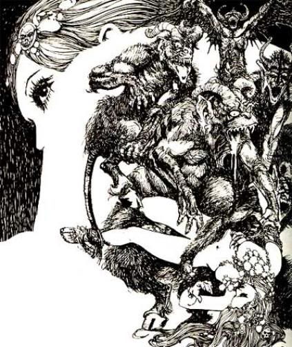
The most popular Spanish artist to hit American in the early seventies was the talented, Esteban Maroto. Born in Madrid in 1942, he began his comic art career serving as an apprentice to Manuel Lopez Blanco in the early sixties. The young artist's first efforts focused mainly on the various romance comics of the time. But before long, Maroto advanced into the adventure, fantasy, and science fiction realms working with his close friends, Carlos Gimenez and Garcia Pizarro, on the Buck John and Merlo the Magician features. Though once Maroto joined the influential Barcelona art agency, Selecciones Illustrada, his tremendous skill as a draftsman and illustrator really began to flourish. Three well drawn strips, Alex, The Beat Group, and Amargo, quickly caught on with the fans due mainly to its collection of beautiful women characters. Maroto's reputation for drawing the female figure quickly made him the most sought after romance artist, especially in England. But his real breakthrough was with the strip Five for Infinity which helped clarify his unique ultra-detailed style. Always lush and decorative, his pages had a hard linear look, similar to his earlier works, but now with an appealing large scale composition. While working at the art agency, Esteban also contributed to the German feature, Roy Tiger, and created his two best known fantasy adventures, Manly, and Tomb of the Gods.


In 1971, an exciting event occurred when Buru Lan created the New English Library and published its first Dracula magazine in brilliant color. Though the oversized periodical was short on pages, it was long on new talent, with the works by Maroto, Sio, Enrich, Bea, Solsona, and other dedicated horror/fantasy artists. Maroto created an exciting sword-and-sorcery feature Wolff for this magazine’s all too brief, twelve issue run. This new horror periodical, published in both Spain and Britain, quickly made a big impact on the general public, as well as one American publisher, Jim Warren. Soon Maroto and his other talented Selecciones Illustrada peers were being showcased in the extremely popular black-and-white Warren magazines, Eerie, Creepy, and Vampirella. It is thought by many that this was Maroto's "peak period" of his long and distinguished career, producing some of his finest works. Finding inspiration from his earlier barbarian tales, Esteban added more fresh experimental approaches to his drawings. His first story for Warren was the beautifully rendered Wolf Hunt, which appeared in Vampirella #14. The artist’s moody detailed pages with their beautiful women and highly textured backgrounds were an immediate hit with the American magazine's male fan base.


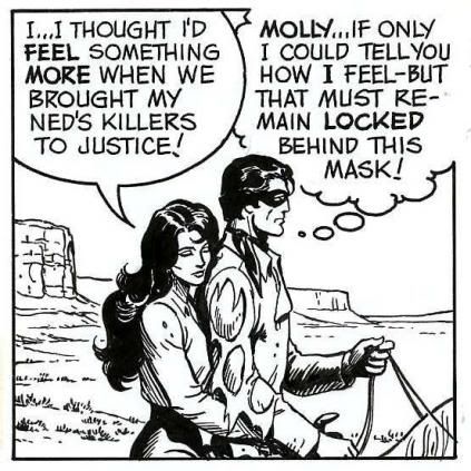
One of Maroto’s special artistic abilities was to draw each page as a whole composition, ignoring panel limitations in favor of combining images into one complete baroque composition. Esteban used all the greatest elements of both his earlier Manly and Wolff strips as a model for Warren's new fantasy creation Dax the Warrior, which debuted in Eerie #39. The artist knew by now what his fan base wanted, and never failed to provide them with a strong dose of sex appeal and barbarian fantasy in his elegant immaculately drawn style. Dax the Warrior had only twelve stories, that averaged a mere eight pages each, but they were always packed with lovely distressed women, horrible seething monsters, an evil wizard or witch, all cleverly reworked as mythological tales, with our fearless lithe hero, Dax.


Some stories were criticized proclaiming Maroto could not write a good fantasy tale. However, I never had a problem with his writing, because the real appeal for these few artistic gems was the combination of sword, sorcery, and sex appeal. Maroto drew almost one-hundred stories over his twelve year affiliation with Warren, but by the end, the artist's early zest for experimentation had waned somewhat, which is seen in his linework losing some of its finesse for a more hurried scratched look. But the Dax stories were always considered to be his favorite work and a collection of ten stories were later reprinted with new dialogue by Bud Lewis for Eerie #56. They proved to be some interesting contrasts from the original scripts, but enjoyable all the same.


The artist also worked for Marvel Comics illustrating their black-and-white books on characters such as Conan, designing Red Sonja's chain-mail costume, and revamping Dracula's daughter, Satana, while completing other various horror and fantasy tales. Over the years, while concentrating on his illustration work he did numerous portfolios, paperback covers, and spot illustrations for Spanish and American science fiction magazines that were later collected in a series of books. In the early nineties, Maroto returned to comics working with DC on Zatana, Aquaman, Amethyst, and The Atlantis Chronicles, before contracting with Topps , other Italian publishers, and and his latest Red Sonja covers for Dynamite Comics.

Saturday, December 1, 2007

More Seventies Comic Art Prices


Looking over my stack of old Comic Buyers Guide issues from the seventies again, I ran across an ad from a dealer by the name of Cartoon Carnival, purveyors of fine comic art, out of Glenolden, Pennsylvania. It had a a blurb where The Man of Steel looks directly at you and says that we all need to hurry and invest in original art--now! Even though thousands of comic books are published monthly, there is only ONE piece of original art created per page. We firmly believe that the art will appreciate in value even more rapidly than the comics! -- I'm sold, anyone have a time machine? The DC and Marvel pages offered looked very cheep to me, but they had this gimmick that if you bought three pages the prices went down even lower. How would you like the cover featured here to Our Love Story #19 by Gene "The Dean" Colan, for the grand sum of $18. Somebody call 911, because I think I've just just lost my pulse! When is the last time you bought a cover for under twenty dollars. What about two beautiful Filipino covers by Ernie Chan of that axe swinging Robert E. Howard hero, Kull The Conqueror #24 with Acala inks or issue #27 with Nebres inks for just $50 each. Need more Colan. WAAAUGH! Howard the Duck was all the rage and Colan strips of the famous fowl went for a whopping $25 each, while a Sunday rang up at $65. But you could have the cover to Tomb of Dracula #64 for a mere forty bucks! Go figure that out? And these weren't even the bargains - that list was enclosed with ever order, prices too low for them to print.


How about some "good" panel pages that were listed above the picture of the Mighty Thor swinging Mjolnir telling us to be sure to include $2 for postage and insurance. Let's start out with a few Dick Dillin pages from Justice League of America, from issue #102-107, lots to choose from, take your pick at $16 a page or (The Deal) three for $40 -- nice but I might spring for some Rich Buckler Deathlock pages (a favorite of mine) from Astonishing Tales #26 for the same price, or maybe more great Colan Dr. Strange artwork from issues #11 or #15 or Dracula pages from issues #38 or #43 for sixteen bucks a page. And to think that Gene's Howard the Duck originals went for the super low price (their words not mine) of $25 to $45 a piece -- makes my hands shake when compared to what else was in the advertisement. How about breakin' your piggy bank open to pay thirty America dollars for "Jazzy" John Romita Daredevil #14 twice-up originals, or just get three for $75 and save yourself fifteen dollars! Rudy Nebres' Marvel black-and-white magazine Deadly Hands of Kung-Fu went for the same price, since everybody was kung-fu fighting, those cats were fast as lightning, these prices were a little bit frightening, but I wish we still had them today. Lots of splashes went for that magic $30 price range and material by Mike Grell from Green Lantern #95 sold for the same price. Nuff said.


Good thing Spider-Man was holding those Visa and Master Charge logos or I wouldn't never been able to afford this stuff. But I know what your thinking, it's still too high, so where is the really cheep stuff? Well, they had other pages for $13 each or three for $30, like George Perez Avengers pages from #155, or try John Buscema Thor #248 art, and Keith Giffin Defenders #46 examples. For the collector on a tight budget you settle for the ten dollar pages, or three for $27, like Bob Brown pieces from Detective Comics #415, 423, or 434, or Curt Swan Superman #258 pages, before I found the least expensive bottom feeder material. If only I could get some Irv Novick Batman pages today from issue #250, 261, 263, or Flash #227 for EIGHT bucks. Great buys the ad stated, but sorry, no deal if you buy three pages on these. I don't think I would have been complaining.

Sunday, November 25, 2007

John Cullen Murphy...Boxing & Broadswords

John Cullen Murphy wanted to be a baseball player when he was a child, but he also possessed a rare artistic talent. Studying under the supervision of artists like Norman Rockwell, Franklin Booth, George Bridgman, and Charles Chapman, helped Murphy develop into a professional comfortable in any medium. Cartoons as well as portraits and magazine illustration were all equally crafted with skill and precision taught to him by his many distinguished mentors. Never neglecting his interest in sports, he got the attention of Rockwell who saw him playing baseball one afternoon and asked the boy to pose for some magazine ads. After Rockwell had done a few illustrations, he soon discovered John's keen interest in art. With a lot of encouragement from Rockwell, Murphy received his formal art training from the Phoenix Art Institute, the Grand Central Art School, and the Art Student's League.


At seventeen, Murphy's first professional work was drawing boxing cartoons for Madison Square Garden's publicity department. While still in High School, sports magazines in Chicago published on average two of his cartoons a week. When later serving in W.W.II, he further pursued his art career drawing spot illustrations for the Chicago Tribune, as well as painting portraits of famous military personnel including General Douglas MacArthur, while still meeting deadlines for magazine covers and other illustration assignments.


Upon his return from the Pacific, Murphy's watercolor boxing paintings in Collier's magazine got the attention of Elliot Caplin, who contacted the artist about collaborating on a boxing strip. The artist did two weeks of samples which Caplin quickly sold to King Features when William Randolph Hearst himself bought the feature. The two-fisted hero, Big Ben Bolt, debuted as a daily on February 20,1950 and a Sunday page followed on May 25, 1952. But Bolt was not your average sports character, a New Englander who graduated from Harvard, he was educated and refined, even in the brutalizing and corrupt world of professional boxing. The character had a kindness, integrity, and generosity that made the strip highly believable as well as entertaining. With his trusted fight manager, Spider Haines, Bolt would win the world's heavyweight crown, only to lose and regain it again as the strip progressed. With an eye injury in the mid-fifties, "Big Ben" became a sportscaster and journalist which lead him to new tales of adventure, mystery, and danger. Always a beautiful woman on his arm, he later dealt with topics concerning social reforms, conservation, and the troubled youth of America. Murphy's strong interest in sports and boxing background made the strip a real knockout with his fans. His vast experience as an illustrator and cinematic approach made any possible situation or local seem realistic and effective.

In 1970, Murphy was honored by Harold Foster's offer to take over the artistic chores on his signature strip, Prince Valiant, the saga of a young Norse prince who becomes a knight of King Arthur's round table at Camelot. It is viewed by many as the premier adventure strip of our time, with over half a century of classic stories and art. Murphy gladly took over the assignment while his assistants remained on Big Ben Bolt until its demise in 1978 with the death of the character. Murphy had approached Foster with samples two years earlier to inquire if he needed help on his strip. When Foster started to think about a possible replacement, three names came to mind, but Murphy's formal art training and illustration experience made him the perfect choice. From the fall of 1970 until early 1980 Foster would give a nicely penciled layout for Murphy to complete and be published.


When Murphy's oldest son, Cullen, graduated college in 1975 he used to contribute story ideas and outlines to Foster. His degree in medieval history persuaded Valiant's creator to use Cullen as the future writer of the Sunday. Bill Crouch also contributed six storylines over the next four years to the historic strip. After forty-three years of guiding his creation, Hal Foster retired from Prince Valiant, with his last pencil layout for February 10, 1980. Foster first debated ending his epic tale, but later reconsidered and sold the property to King Features recommending that John and Cullen continue the tales. Murphy's daughter, Meg Nash, also joined the family on the strip with her lettering and coloring of the Sunday page.


Murphy and his family worked on Val's adventures for thirty-four wonderful years before he handed over the feature to the current artistic team. The remarkable quality of this unique strip survived even thought the size of the page diminished greatly over the years. Murphy never tried to copy Foster's distinctive style. His preference for a harder pen line rather than a softer brush look helped give the strip a more angular feel than its original creator's version. Murphy was assisted by artist Frank Bolle in layouts and research, but John's detailed pen work could still be seen in all the finished pages. Murphy's superior illustrative skills was also highlighted by the expressions on the characters faces being confirmed in their hand placement and use in conveying the story. His enormous library of books and reference materials given by Foster, always made the episodes fresh with its many historical characters and places. With little known about the time frame of Prince Valiant, the fifth century after the fall of Rome, Murphy and his staff could take creative license to create a rich visual tapestry of castles and palaces with elaborate and ornate surroundings. John Cullen Murphy's talent and professionalism helped maintain Prince Valiant's worldwide popularity, and has won him numerous awards, including the National Cartoonist Society's Best Story Strip -- more than any other syndicated cartoonist. We are all fortunate that this young boy gave up his sports ambitions to become one of our most respected and thought of cartoonists in America.

Friday, November 16, 2007

Dick Dillin - National's "Team" Player


When you think of great "team" artists that drew comics with so many characters, who often comes to mind? You might like John Byrne on his wonderful X-Men run, or perhaps George Perez for his beloved New Teen Titans with all those heroes and villains that filled the comic pages. Maybe you’re a fan of John Buscema’s art on the Avengers, or Curt Swan for his Legion of Super Heroes work in the mid 1960s. But the one artist that had a real gift for producing those "team" books for DC was the underated comic genius, Dick Dillin. Richard Allen "Dick" Dillin was born on December 17, 1929 in Watertown, New York, and from an early age knew exactly what he wanted to be when he grew up. A comic book artist! Inspired from the great strip masters, Milton Caniff, Alex Raymond, and Hal Foster, young Dillin used to copy Prince Valiant panels to hone his skills on the one and only drawing board he ever owned. After graduating Waterford High School and a stint with the 8th Army Division in Japan, Dillin attended Syracuse University on the G.I. bill as an art student. Soon married and needing to support his new family, Dick pursued other work, but being bitten by the art bug, Dillin left his factory job for New York City. Dillin's artistic skill quickly landed some commercial and magazine illustration before achieving his goal of penciling stories for both Fawcett and Fiction House. His success on their features eventually lead Dick to the steps of Quality Comics where he illustrated romance, science fiction, horror, and war titles, until his big break as illustrator of his first "team" book, Blackhawk. Dillin worked at Quality Comics for five years, further developing his skills as a penciler before the untimely demise of the company and the unexpected sale to National Comics the rights to Blackhawk. Fortunately, when Dillin hit the streets of New York in search of work, DC was looking for him to continue his run on the popular title, which started his long and friendly relationship with National Periodical Publications.

After years of solid work on the Blackhawk, there was a change in direction at DC, and the title was canceled. Dillin was given a few issues of Batman, Hawkman, Green Lantern, Flash, and World’s Finest Comics, before landing on his best know work, DC’s ultimate "team" book, Justice League of America. Being initially worried about drawing all the super heroes together in every issue, Dillin quickly got over his hesitation and lasted a historic twelve years on the feature for a total of one hundred fifteen consecutive issues!


Dillin is fondly remembered today not only for his extensive run on Justice League of America, but by adding so many characters back into the DC mythos. He reintroduced to a new audience the likes of Red Tornado, Quality stars Plastic Man and Uncle Sam, Leading Comics’ Seven Soldiers of Victory, Black Canary, Hourman, Dr. Fate, Starman, Phantom Lady, Doll Man, The Ray, Black Condor, The Human-Bomb, Dr. Mid-Nite, Sandman, and other historic heroes and villains from the Golden Age. Doing some amazing detailed work, Dick never missed a deadline on JLA under the grueling pace to pencil the book. He even found time to do some back-up stories for other titles, such as the Atom features in Action Comics, Detective Comics’ Robin stories, and Superman’s Fabulous World of Krypton tales.


Always wanting to improve on his artistic talents, Dillin enjoyed many art forms. Whether doing painted portraits of family and friends, or animation storyboards for TV cartoons like Johnny Zero, The Mighty Hercules, and Johnny Cypher. Dick even produced modern fine art in the vein of Jackson Pollack. Unfortunately, a star that burns twice as bright -- lives half as long. So was the fate of Dick Dillin, who passed away at the young age of fifty while working on JLA #184 in 1980, after only completing the first two and a half pages of pencils. But he will always be remembered as the fun-loving artist with a room full of children, enjoying family and friends while creating the comics he loved so much.

Friday, November 9, 2007

Some Wacky Humor Titles


I never appreciated the humor artists as a kid, since the super-hero genre was really my bag, until I gave them a long second look as an adult. (If I'm now considered grown up?) Then I discovered the amusing artwork of Bob Oksner on The Adventures of Jerry Lewis. His zany off the wall stories were just wonderful, and I especially loved those Flash, Superman, and Batman cross-over issues, because I was crazy about the characters. They were a real blast, and started my interest in other DC humor titles like the earlier Adventures of Bob Hope, or TV related properties such as The Many Loves of Dobie Gillis, which I've seen a few pages of original art surface on eBay recently, but have not yet been lucky enough snag one for my collection. I did have the pleasure of viewing some rare original Shelly Mayor Sugar and Spike pages from a local friend who is also a cartoonist/collector. Until recently these beauties were impossible to find, since Mayer loved doing this comic based on his children. Sheldon kept most of his original artwork, but some pieces have shown up lately in auctions. The blue pencil details under the India ink were really fantastic to behold, giving the pages a cool look, and they had a lot more punch that I'd imagined from just seeing the printed
book.


National Periodical Publications had many fun titles like Fox and Crow, Laurel and Hardy, Stanley and his Monster, Swinging with Scooter, Angel and Ape, Welcome Back Kotter, and a score of others that were often a strange mix of a humor/teen type book in the Archie tradition. Though Archie Comics always had them beat on any of DC's attempts to enter the wacky teen market. I enjoy them all now because of the great art by Scarpelli, Estrada, Severin, Oksner, and others. But still, I was never a real fan of the "big foot" funny animal school that Harvey, Dell, and Charlton, seemed to produce the best product overall. But what I really loved were those spot cartoons by Henry Boltinoff for the Cap's Hobby Hints, that taught us all those neat tricks about model building. Since I was assembling all the Aurora monster and cave man kits at the time, any help on making them look better was information well received. I always enjoyed any of the fact pages that taught me something that were often shoecased in the DC titles. I once saw a bunch of these Cap's Hobby Hints originals and literally drooled all over them, since their simplicity was a marvel of design and clarity. But before I realized I really needed one, they were gone down the art highway to another quick thinking collector. Boltinoff also did some Casey the Cop gag panels and other features, before he moved on to his syndicated park ranger daily, Woody Forest, and his later extremely popular Word Jumble puzzle panels.


Remember those little Sergio Aragones drawings in DC's Plop! comic from the seventies. Another DC experiment that tried to compete with the one and only MAD magazine, which of course never really occurred. But the energy and humor of Aragones little figures running across the Plop! borders or in pages of MAD work just as well today, where they can still be seen in every issue. MAD has also been running some great reprint features on artists Bill Elder and Wally Wood, and the wild cartoons of Basil Woverton's really knocked me out. Though, in my humble opinion, Woverton's art was not as powerful in black and white when compared to those spectacular Plop! covers which are truly goofy comic gems. And what about Sergio Aragones long running Conan spoof from Marvel, Groo the Wanderer, that was also a favorite of mine, and those originals go for some sky high prices. Not Brand Echh, was another wonderful Marvel book from the sixties that poked fun at itself and other publisher with that zippy Marie Severin artwork and all the other solid figure artists from their talented bullpen in every issue, similar to the later What the...?, laugh comic of years later.


But I believe that my all time favorite humor art must be Harvey Kurtzman's Hey Look! strip feature, was first published in Patsy Walker #22, way back in May 1949. It was the first work that Kurtzman had complete control over and and totally defined his abilities in storytelling and style, using just those two simple characters, always really killed me.

Thursday, November 1, 2007

Russ Heath's Lone Ranger Rides Again


When Russ Heath was chosen to illustrate the new syndicated Lone Ranger strip in 1981, he soon got a call from Amber creator Doug Wildey. "Any illustrated strip is going to fall behind deadlines, and you will call your artist friends (to help), and stay up working all night," exclaimed Wildey. Heath soon found out how true that was, after only a few short months. Russ later said, "He sure as HELL was right! I called on Doug to help, and I called on others...If you've never had a syndicated strip, you just can't imagine what it entails...I had no time for exercise and put on thirty pounds."This almost forgotten feature that followed on the heels of the movie revival, The Legend of the Lone Ranger, debuted on September 13, 1981. Giving the feature one final strip incarnation of Fran Striker's world famous Western hero, created for a 1933 Detroit radio show. We all know the story right? West Texas in 1880... a group of six Texas Rangers lead by Captain Dan Reid rode towards a gap in the mountains...there Butch Cavendish's Gang launched a surprise ambush...and when the dust settled and the battle was over...all the Rangers were dead except the Captain's brother, John. Nursed back to health by his Indian friend, Tonto, John Reid took on a mask and vowed vengeance against all evildoers. This lone survivor...this Lone Ranger. (Which was actually the biggest misnomer in comics since Tonto was just as important in the strip, not to mention their beloved horses, Silver and Scout!)
The first artist to draw the famous lawman in 1938 was Ed Kressy, which most fans believe looked awkward at best in his adaptation of the material, but it had some great scripts by Striker. It was followed shortly by a brief interim stint illustrated by Jon L. Blummer, whose unigue style I really enjoyed. But the artist most fans remember and recognize today for the Lone Ranger was artist Charles Flanders, and his thirty-three year run on this Western legend. Better than most who drew the feature, it hit its peak in popularity in the mid-forties before slowly sliding down in quality to develop the look of a cheap grade-B Western (with no sets or background atmosphere of any kind). There was a boost in the title when writer Paul Newman and ghost artist Tom Gill did some later Sundays, as there solid teamwork had shown on the popular Dell Lone Ranger comic book. Although the strip seemed to be getting better with time, it still could not stop cancellation by the syndicate in late 1971. But hold on there folks, for the best artist and writer team is yet to come!

After searching for the right talent, the New York Times Special Features Syndicate finally chose comic book artist Russ Heath and longtime DC writer Cary Bates to produce the work. The strip even had a unique opening (breaking with most strip precedent) when the first daily just continued the storyline from their Sunday page the day before. Of the other creators who tried out for the new feature, only Gil Kane (who did the Aurora's 1974 Lone Ranger model kit illustrated comic) was considered a rival to Heath's skill and precision with Western subjects. Some of those rare Kane tryout dailies and Sunday still exist, though most of the Heath/Bates material was discarded by the syndicate making the art harder to obtain. I've had one daily I picked up a few years ago, and can tell you the quality was as good or better than any other Heath art I 've ever seen. I though these originals were difficult to find, until Heath consigned his work to a local auction house, so now some fantastic example have recently surfaced. However, you sometimes have to search for a good piece with the Ranger, since he was disguised in many of the storylines, and then his trusted scout Tonto was wonderfully showcased.


Clearly the best artistic team to ever produce the feature, unfortunetly, the Lone Ranger really never got its due. Published in no more than sixty papers at the height of its all too short two and a half year run, it ended on April 1, 1984. Most of us never even saw this beautiful strip the first time around, unless you lived in larger cities like Seattle or San Francisco. And when you did see the strip, the Sunday format usually lost its top tier splash panels, being cut down for space in many of the papers, so readers just missed out on what Heath was trying to do altogether. You can see that Russ put his heart and soul in the work, spending up to twelve to fourteen hour a day at the drawing board. Yet the high quality of art and writing was as fresh and alive the last day of the strip as the first day they started. Heath had his hand in all aspects of production, working his rich and detailed style on the preliminary sketches, pencil layouts, color proofs, test pages, as well as keeping up the penciling and inking the strip.


If not for Greg Theakston's fantastic Pure Imaginations black and white Lone Ranger reprint from 1993, most of us would never had the pleasure to read these delightful stories, unless you collected dailies or haunted some library newspaper vault. But don't take my word for it, just check out thes panels provided and that last Sunday page as the Lone Ranger and Tonto ride out into a sunset for the final time, with none other than Heath and Bates saying good-bye.

Wednesday, October 17, 2007

Everybody Loves Raymond


Everybody loves Alex Raymond, or at least I think they should! Who can doubt his impact on the comic art medium and American pop culture. George Lucas credits Flash Gordon as his inspiration for Star Wars; not to mention it kept actors like Larry "Buster" Crabbe and Johnny Weissmuller working for years. Raymond's millions of fans worldwide make him one of the most influential artists of our time. But I dare say his best creation was the "film noir" detective strip, Rip Kirby. But, don't get me wrong, Flash Gordon, Jungle Jim, Secret Agent X-9 and the other projects Raymond produced during his career are undoubtedly some of the greatest comic works of the century. But for all of Raymond's skill and talent, I believe it reached its peak with Rip Kirby. Perhaps its also my favorite strip because I can still afford some examples!

The story goes that when Raymond returned from WWII he was unable to resume Flash Gordon because of King Feature's contract with Austin Briggs. Not wanting to lose Raymond to a rival syndicate, they let him produce a new feature. It's debatable if King Features editor Ward Greene created the character, that was later more fully developed by writer Fred Dickenson. Whether Alex created the character or not, it was his success and name recognition that mattered with his audience. An instant hit for all involved, it even gave Raymond part ownership in the strip. And why not! Rip's not your average private eye. He's a perfect gentleman, who's also a brilliant scientist, athlete, Marine reservist, and sports car buff. Using more brains than brawn was his usual modus operandi in solving mysteries, but he still had time for a slug-out once in a while. It has many of the classic elements of detective fiction, but with a twist -- horn rimmed Buddy Holly glasses and a pipe! Similar in ways to other heroic gumshoes like Margery Allingham's Albert Campion and his side-kick Lugg. And to sweeten the deal, all the supporting cast are just as interesting as Remington, whether they're beauties, gangsters, hoods, con men, or cops.


Who would't want the life of Rip Kirby? A Mr. Lucky that lives in a snazzy New York apartment with his trusted aide, the frail balding butler Desmond. A reformed thief who's as skillful in making a soufflé as using guns or picking a lock. Next, Rip is blessed to have a knockout fashion model for a girlfriend, Honey Dorian, who often travels with him around the world on his exotic cases. We also have some interesting heavies like the charming femme fatale Pagan Lee. She shows up in my favorite storylines to the dismay of Honey since there is this love-hate relationship Pagan has with Rip. The two girls make interesting copy since they are portrayed as total opposites. A dark seductive worldly Pagan "yin" played against a pure sweet heavenly Honey "yang." And who could forget Remington's greatest villains like the Mangler or gambler Fingers Moray.


The strip debuted on March 4, 1946, and quickly introduced many new and innovative techniques to the medium. Raymond constantly searched for different ways to carry the story visually to readers with experimentation in his style. Driven for a clear and direct graphic, he changed the look every six or seven weeks on the daily. Always in firm control of his art and career, King Features offered Raymond $35,000 a year to produce a Sunday Rip Kirby page. Raymond declined citing the extra work the page would impose on his already limited free time.

We know Raymond used models, took reference photographs, and swiped from magazines in his efforts to absorb different approaches. He worked close to deadlines, leaving only three weeks of strips at the time of his death from an auto accident. He was inspired by living and drawing in an illustrator's community with the likes of Stan Drake, Al Parker, Robert Fawcett, Albert Dorne, and others. It gave him fresh ideas on Rip that helped promote the realistic story strip with a fresh contemporary new look. Abandoning the old soap opera approach of a simpler outline style, Raymond brought numerous slick advertising techniques to the daily. Often he used a minute and detailed, close up, “big head” approach on Honey and the other beauties of the feature.


The strip can also be appreciated for its sophisticated use in "spotting" heavy black ink. Early Rip's seem sparse in the placement of blacks, being applied mainly for night scenes. But about three years into the daily, Raymond switched to using a heavy black even when in full sunlight. On one of Raymond's visits to Drake's studio he explained using black areas as “pools of quiet” for pacing. It served as a pause for the viewer, something to the slow the reader's eye across the strip's panels. Later in the run, Alex's simple backgrounds fully develop into a photo realistic approach to the surroundings as well. Also with Stan Drake's influence we see an expanding use of character expressions within the Rip Kirby cast.


Perhaps Rip Kirby was such a success because Alex Raymond was a larger than like character himself that had many of the qualities of the famous detective. More sophisticated and urbane than the average artist, he was a striking figure: matinee-idol handsome, athletic, hugely talented and admired among his peers. Raymond's art influenced many of the talented comic artists of today including Frank Frazetta, Al Williamson, Wayne Boring, Lou Fine and scores of others.


To mention a few of his achievements, Raymond won the coveted Ruben Award in 1949 for Rip Kirby, was a member of the Society of Illustrators, and served as president of the National Cartoonists Society for 1950 and 1951. Even when producing both magazine and book illustration, and his combat paintings displayed in the National Gallery of Washington, DC, Raymond still always championed the comic strip as his preferred art form. He once said, "I decided honestly that comic art work is an art form in itself. It reflects the life and times more accurately and actually is more artistic than magazine illustration -- since it is entirely creative. A comic artist is playwright, director, editor and artist at once."